w-abstract

Took a much needed detour few nights ago from the usual acrylic to watercolour, and voila! (Here is what happened…)

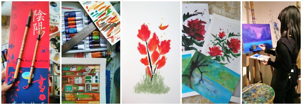
A few things used to create this piece:

  • A water colour paper (I used Studio Watercolour Pad by Fabriano)
  • Water
  • A set of 16 water colours (doesn’t have to be exact, as long as you’ve got a variety of colours to experiment with)
  • A small flat brush
  • A hint of abstract imagination

Selecting a suitable brush is an essential step – especially when dealing with watercolour, a not so forgiving medium, it is important to know/understand the different types of brushes you want to/will be using. I found the following picture and the link to be quiet handy for starters; it labels some of the basic brushes that you will come across and how each one functions:

(Check out the great link on the picture below for information on the different brush usages)paint brushes

And… once you’ve picked your brush(es) that you want to work with, experiment a combination of different colours to see what flows together 🙂 I started with darker medium for the ground, and I added warm colours to represent the changing colours of the tree leaves as I moved towards the top. Be sure to wet the areas of the paper you want to paint with water before adding colour, it gives an extra touch to the abstract look.

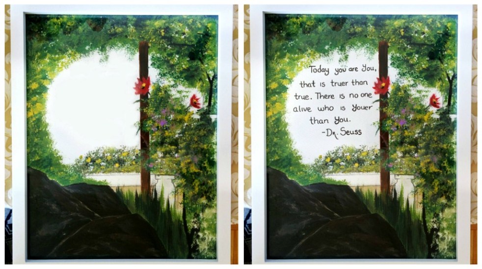
Here it is, the final piece framed and hung: collage2

fonts

Hello, everyone! I’m happy to say that this piece is finally complete!!

10704136_10154732673880035_7393626257325460923

collage art

Here are a few steps followed from a tutorial to create the background using acrylic:

❶ Pick a size of canvas that best works for the painting. I used a 15 x 30 canvas.

❷ Mix a few different shades of browns. Use darker shades for the trees that are closer to the foreground and lighter shades for the trees that are slightly blending in with the background. Start drawing in trees a little above the half point of the canvas. Trees closer to the foreground should appear to have thicker trunks and branches than the ones that are further back.

❸ Mix a variety of greens (nature painting = greens, greens and more greens!). Using the dry brush technique, which uses more pigment than water, start painting in the darker shades first. For this painting, I added in the lighter shades to all the areas where I felt the light may fall.

❹ Add in a bit of yellow to highlight the small areas of the painting on which reflected light appears the brightest (this can also turn out to look like flowers, a bonus).

❺ Add a variety of plants all around using different kinds of brushes to give different shapes and textures. Add in a bit of blue for the sky (thin the paint first using water) – be sure to make the edges darker and as you move in towards the centre, tone down the shade and slowly blend it into white.

❻ Using a Fan Brush, add in some white for the fall. This is fairly easy to do, you just start from the top and pull down the brush to create the perfect texture/strokes. Voila! You’ll have yourself a nice fall. This brush makes this step run smoothly 🙂

**This can get very time consuming depending on the canvas size, be prepared to put aside some good amount of working hours for this piece!

fonts2

Ah, a long over due post on this one. Here it is, the final piece.

The painting of the couple was customized to match the description I was given. I followed a tutorial done by a very talented artist to complete the background, pathway and added my own touch to the lovely greenery and the pond.

In all honesty, this was probably the most tensed I’ve been finishing a piece because it illustrates a moment that is significant to them. I knew I had to get this right and there was no room for errors. It took long hours and few back aches, but I couldn’t be happier with the end result!

What I adore the most about this piece is that one hidden detail I was specifically told to add in: The flower in the man’s hands symbolizing the one he gave on their first date.

It has now been shipped and hung up somewhere at a newly weds house ❤ – which is quite humbling to know.

I’m very thankful to have had this opportunity!

If you’ve got any inquiries or you’d like to place an order, feel free to contact me.

collage2-
When We Met, 2014.

collage1=Here are a few tips I learned from the tutorial 


How to create the fog effect: You first need to decide on three shades of blue. Once you’ve picked them, start with the lightest and paint on the next darker shade as you get closer to the foreground ([!] just be sure not to completely block out the layers painted before). There is no need to wait for the previous layers to dry; adding the colour on top helps blend them in a way that gives a better flow.

Fine line trees: [!Make sure you’ve got a variety of shapes going for the tree trunks and branches! The last thing you want is forest full of trees that look exactly the same (unless of course if that’s what you are going for).  I found the perfect liner brush at De Serres Art Store called Blackgold liner paintbrush that I highly recommend – it’s very easy to use/wash and flows beautifully. They’ve got sizes ranging from 0 – 5x, you can choose whichever one best suits the size of your painting.

Greenery: Pick the angle your light source is coming from. Start with darkest shade of green and dab on the lighter shades on areas where you want the light to fall. This can take a flat canvas/paper and give it a realistic/almost three-dimensional feel to it. It allows you to focus on certain aspects of your painting and set a mood. That was the goal of the greens (and green-yellows) in this painting! 🙂 Adding in a last (thin) layer of white helps highlight the portions that stick out the furthest into the light. Our eyes are naturally attracted to light and as an artist, you want to make use of that.

“Serenity”

The latest 10 x 30 canvas piece personally requested by a buyer.

She wanted a Buddha statue + flowers + waterfall.. and voila!

collage03-s

Acrylic, acrylic and more acrylic for this piece! I do prefer acrylic paint over all the other kinds; I find it to be the quickest to work with, especially on larger canvases. It dries fairly quickly, which means waiting period for each layer to dry is cut short.

On the downside: Fast can be a little too fast – because they dry within few minutes, it can also mean trouble if you aren’t quick with the brushes. Especially on those palettes! Tip: Using a moisture-retaining palette helps, you can find one at an art store or make one at home. 🙂 (I’ll create a blog on this soon)

A bonus: you can easily thin acrylic paint for more balance and colours, as it is water based.